


Established over 125 years ago, the National Trust is the largest conservation charity in Europe. The organisation and its volunteers help care for 780 miles of coastline, more than 250,000 hectares of land, over 500 historic houses, castles, parks, and gardens and one million works of art. With so much heritage and history to draw upon – and so many different aspects to its work – how does the Trust ensure that its licensing agreements reflect its core values, visually and ideologically?
That was the task facing brand extension agency Skew Studio, who were commissioned to devise a new licensing style guide for the organisation earlier this year. Licensing Biz sat down with Skew Studio’s Oliver Dyer and the National Trust’s Clare Brown, Head of Brand Licensing and Retailer Development, and Michaela Davies, Brand Licensing Manager, to talk about the process, and why every National Trust product has a story to tell.
Ultimately, what’s the most important thing about a National Trust product?
Clare: For me, the most important thing is to create products that are inspired by and intrinsically linked to the Trust in some way, which allow us to use the storytelling behind our properties, our places and people to emotionally engage with our consumers. Hopefully the products help people identify with the Trust, but equally, we want consumers to be inspired to become a part of it all, because at the end of the day we rely on people’s benevolence to volunteer to be part of our cause and help us carry on the important conservation work that we do.
How do you select your retail partners?
Clare: We’re very selective about who we partner with. As a conservation organisation we’ve been talking about nature and how important it is for a very long time and even more so now with the challenge of climate change; we have plans to establish 20 million trees across England, Wales and Northern Ireland and reach carbon net zero by 2030, for instance. So, we are very clear on our criteria for licensees, and sustainability is at the top of the list. We do a lot of research, and we actively then go out and target organisations that are strong in this area.
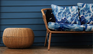
The three large product category areas that the Trust is known for are home, garden and lifestyle gifting, but we do have other categories outside of that, such as children’s products.
Creating a coherent ‘look and feel’ for National Trust branded collaborations seems like such a mammoth undertaking. What were the first steps?
Clare: We’re a massive organisation, and we mean an awful lot of things to a lot of people. So you’re right, translating all of that into a licensing programme was a huge task.
The point about our purpose is that we protect and care for our places, so that people and nature can thrive. We believe nature, beauty, and history can benefit everyone. So we exist ‘for everyone, for ever’: that’s at the core of our mission.
Our membership audience is also becoming younger and more diverse – that’s because our offer is so broad and we’ve been engaging with different organisations, like Sports England; we are the largest host of Park Run in Europe, we have a growing number of campsites we also have children’s playgrounds in all our properties now… Also, we are one of the biggest art commissioners in the UK; we use art to move, teach and inspire people. More and more people are enjoying our places for different reasons. So initially we passed all that over to Oliver and his team, we did a bit of brainstorming, and Skew really took it by the horns and got under the skin of what the National Trust is about.
Oliver: I wrote down and double underlined that phrase, ‘for everyone and for ever.’ As a target, from a creative point of view, that’s pretty big! But as an organisation the National Trust is really clear about what it is, and who it’s appealing to.
 Our first job was to try to join the dots, to match up the Trust’s visual, tangible assets with its intangible assets – what people think and feel towards the properties and towards the Trust as a whole. And once we’d done that, it was a case of looking at what consumer trends are coming up, then translating them in a way that will work well for the Trust and serve all the different segments of its audience, and also work well for retail, so that by the time the Trust get to the point of dealing with licensees and retail buyers, we know there’s going to be a real appetite for what’s been developed.
Clare: At first I thought that translating everything the National Trust is about was going to be an almost impossible task, but Skew’s designers are so clever. They not only picked up on all the key points, but they made it contemporary, which was just wonderful.
Can you explain how the new style guide works in practice?
Michaela: The majority of our licensed products have been developed to reach audiences beyond those that visit our locations, as a way of broadening our appeal and allowing more people to connect with our charitable activities. They’re for everybody and are just as likely to be on sale in a local garden centre, or in John Lewis.
 The style guide is such a useful tool; not only has it got fantastic design assets in there that are really inspiring, but it also has packaging ideas as well. Packaging may not be hugely exciting but it’s a big part of how we present our charity messaging to consumers, and flag things like our sustainability criteria. The style guide gives guidelines on where and how we put our messaging on the packaging, so that we’re giving a consistent message across all our licensed products, because they can be very diverse.
If you’re a consumer, shopping in a supermarket with the kids in tow, you might only have a split second to make a decision about what to buy. You might pick up a National Trust product and think, ‘Oh look, it says here that they give a donation from the sale of this product back to the National Trust”. So having that consistency of message on packaging is important for us. Buying a National Trust branded product could be the first touchpoint non-members have with us.
Oliver: I’d actually use the word coherence rather than consistency. What the National Trust has to offer is so wide, while you want to be able to present products that all work together on a shelf, they can be quite different visually, depending on the type of item and who it’s for. I think that the work that we all did together was to try to give retail partners the opportunity to take what was on offer and make it their own, and even take it in new directions, but ultimately have it make sense and be coherent overall.
Michaela: When I started working in brand licensing at the Trust in 2019, the only assets we had were photographs of our amazing places and landscapes. But now, our main style guide has six diverse themes [see below]. We not only have downloadable assets in the guide that our licensees can use and create products with, but it’s inspirational, too.
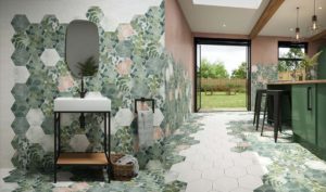 For example, last year we signed Sarsen Stone Group, who make interior wall and floor tiles. From the guide, they picked up on one of the themes that Oliver’s team came up with that we’ve called Under the Canopy; it’s based on looking up into the woodland tree canopy and the patterns, light and colour you see through the leaves, and Sarsen Stone took that as their starting point. They also visited one of our beautiful arboretums, Winkworth, and took photographs of it back to the design team, who were really inspired by it. They even named that particular collection after the Arboretum. So, it’s a lovely bit of storytelling; they’re not just interior tiles with leaves on, there’s a great link back to the National Trust.
Oliver: We also created a lookbook that was like a magazine, to give people something that was quick to look at and focused only on product inspiration, to show how different looks could be interpreted in different product categories for different parts of the market.
Michaela: Our style guide for kids’ products has six categories too. Some of our 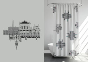 licensees won’t have time to sit and take in everything the Trust is about, but with six different core designs, it’s easy for them to flick through and think, that one’s not for me, I’ll go on to the next one…
Clare: I have to say, the children’s style guide that Skew produced is particularly fantastic. It takes important issues such as climate change and presents them in a really innovative and playful way.
Oliver: The back story behind the product is really important, but that’s not what people buy, when it comes down to it; they buy really great products. And that’s what the National Trust team are producing. There’s a huge amount of work involving in dealing with licensees to produce something that people really love. What we did was really just the start of that process. It’s the team at the National Trust that are bringing it to life and doing a great job.
THE NATIONAL TRUST’S 6 STYLE THEMES
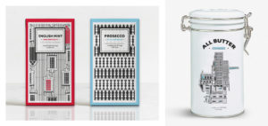
Architectural heritage
Inspired by the exterior of National Trust properties designed by some of the world’s greatest architects and artists, these designs are characterised by classical forms and symmetry.
Wonderful details
From decorative cornices to elegant sculptures, the Trust’s properties accommodate a wealth of details and grand statement features, each with their own story to tell.
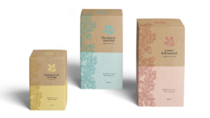
Along the country lane
A tangle of grasses, seed heads and native wildflowers was the starting point for stunning natural designs with striking pops of colour and bold silhouettes, evocative of an afternoon’s stroll in the countryside.
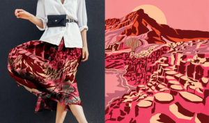
Vibrant landmarks
An homage to the vision of the National Trust’s founders, Octavia Hill, Robert Hunter and Hardwicke Rawnsley, who pledged to preserve the UK’s historical and natural landscapes so people could reconnect with nature for everyone, for ever.
Along the coast path
Evoking the 780 miles of beautiful, dramatic and diverse coastline managed by the Trust, which is home to a wealth of wildlife and nature.
Under the canopy
A celebration of the beauty and subtle textures found in natural landscapes, with designs that combine fresh, bold colours and pastel shades across delicately layered shapes.